
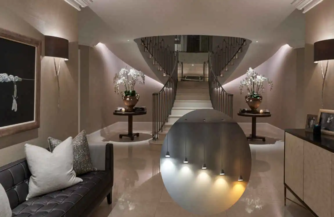
Choosing a paint colour is more than picking a shade you like. Lighting can change how that colour looks once it is on your walls. A soft beige may look warm in one room but almost grey in another. A white wall can appear creamy during the evening and bright during the day.
That is why understanding how lighting affects paint colour in interior design matters. Natural sunlight, light bulbs, room direction, shadows, and even the paint finish can all influence the final look.
Before painting your room, take a little time to observe how much light it receives. Then test your favourite colours in both daylight and artificial light. This simple step can help you avoid expensive repainting and make your room feel more balanced.
How Lighting Affects Paint Colour Appearance in Interior Design
Natural Light and Paint Colors
Natural light changes throughout the day. Morning sunlight can feel soft and slightly cool, while afternoon sunlight may be brighter and warmer. As a result, the same wall colour can look different from morning to evening.
A light colour may appear brighter when strong sunlight enters the room. In softer daylight, the same colour may look calmer and less intense.
Windows also make a difference. A large window can flood a room with light, while a small window may leave some areas darker. Sunlight direction and nearby buildings, trees, or curtains can also affect how much light reaches your walls.
Artificial Lighting and Wall Colors
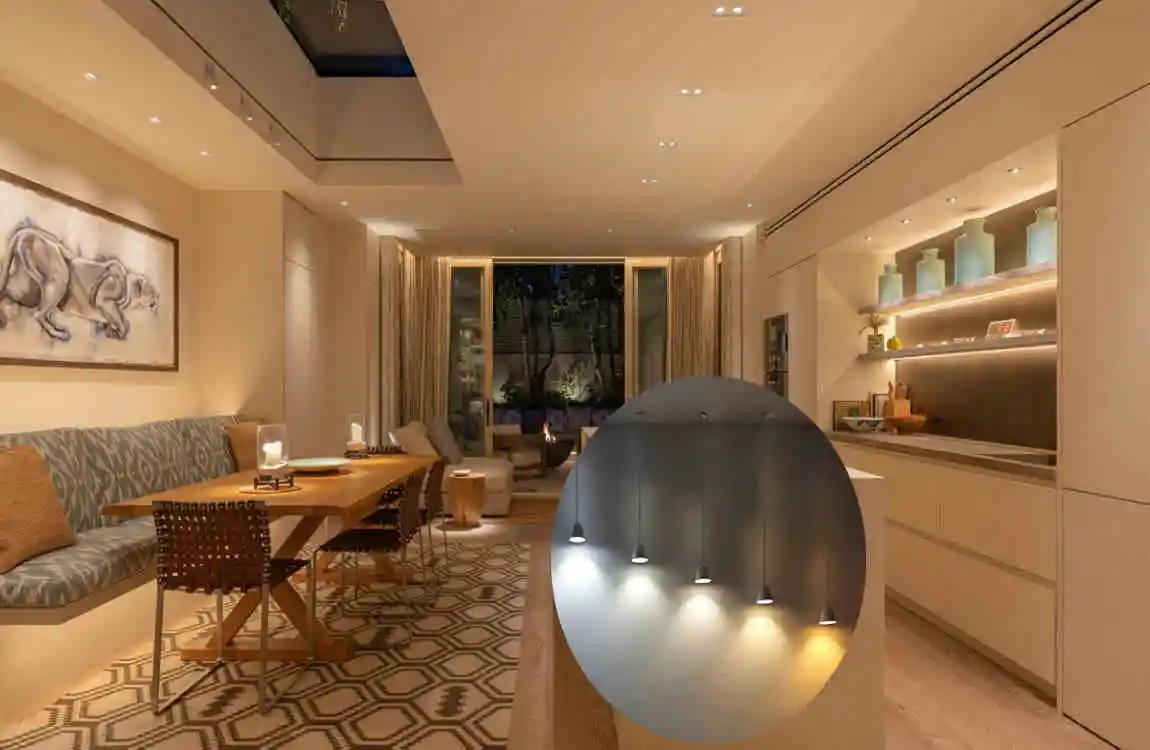
Artificial lighting becomes especially important after sunset. Light bulbs have different colour temperatures, which can change how paint looks.
Warm lighting can make walls appear more yellow, creamy, or cozy. Cool lighting can make some colours appear cleaner, bluer, or slightly sharper.
For example, a neutral grey wall may look warmer under a warm bulb and cooler under a cool bulb. This is why a colour that looks perfect in a paint store may look completely different at home.
Light Intensity and Colour Perception
The amount of light also matters. Bright lighting generally makes colours easier to see and can make some shades appear more vivid. Dim lighting can make colours look darker or less noticeable.
Shadows are another important factor. Corners, ceilings, furniture, curtains, and architectural details can create areas where the paint appears darker.
If your room has uneven lighting, always test the paint on more than one wall.
How Room Direction Changes Paint Colour
The direction your room faces can strongly influence its natural light.
North-Facing Rooms
North-facing rooms often receive softer and cooler natural light. This can make cool colours feel even cooler.
Grey, blue, and green shades may stand out more in these spaces. If the room feels too cold, consider warmer neutrals such as creamy white, beige, soft taupe, or warm greige.
A warm paint colour can create a more comfortable feel without making the room overly bright.
South-Facing Rooms
South-facing rooms usually receive stronger natural light for much of the day. Bright sunlight can make colours appear more intense.
Soft neutrals can work well because the natural light helps keep the room lively. However, very warm colours may become stronger under direct sunlight.
If you prefer a calmer look, consider softer versions of your favourite warm or cool shade.
East- and West-Facing Rooms
East-facing rooms typically receive more morning light. This can make colours look brighter and warmer earlier in the day.
West-facing rooms often receive stronger afternoon and evening light. Their colours can therefore change noticeably as the day goes on.
Think about when you use the room most. If you mainly use your bedroom in the morning, focus on how it looks then. If you spend most of your time in a living room during the evening, check the colour at that time too.
Choosing Paint Colours Based on Different Types of Lighting
Warm White Lighting
Warm lighting creates a comfortable and welcoming atmosphere. It can make white, beige, cream, and brown tones look warmer.
Warm bulbs can also add a soft golden quality to some neutral colours. This works particularly well in bedrooms, dining rooms, and living rooms where you want a relaxed atmosphere.
However, very warm lighting can make some white paints appear yellowish.
Cool White Lighting
Cool lighting has a cleaner and brighter appearance. It can emphasise blue, green, and cool grey tones.
This type of lighting is often useful in kitchens, workspaces, and areas where you want a fresh, energetic feel.
If you already have cool lighting, test grey or blue paint carefully because the combination may make the room feel colder than expected.
Neutral Lighting
Neutral lighting sits between warm and cool tones. It can create a more balanced look and help many paint colours stay closer to their natural character.
Neutral lighting can be useful when you want flexibility in your interior design.
LED Lighting
LED bulbs come in different colour temperatures, so not every LED produces the same type of light. When choosing paint, check the lighting already installed in your room.
CRI, or colour rendering ability, also matters because better colour rendering can help surfaces and finishes appear closer to their actual colours.
The best approach is simple: test your paint sample under the actual bulbs you plan to use.
How Paint Finish Affects Colour Appearance
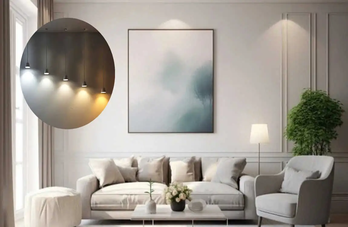
Paint finish can change how light interacts with the wall. The colour itself may stay the same, but its visual appearance can change because of reflection.
Matte and Flat Paint
Matte and flat finishes have very little shine. They absorb more light and provide a soft, smooth appearance.
They’re excellent choices for bedrooms, ceilings, and living spaces where you want a calm look.
Because they reflect less light, they can also help reduce the visibility of minor wall imperfections.
Eggshell and Satin
Eggshell and satin finishes provide more reflection than matte paint. This can make the wall appear slightly brighter.
They are practical choices for areas that need easier cleaning and moderate durability.
The added sheen can make colours appear more noticeable under direct lighting.
Semi-Gloss and Gloss
Semi-gloss and gloss finishes reflect considerably more light. This creates highlights that can make the surface look brighter and more dramatic.
These finishes are often used for trim, doors, cabinets, and other areas where durability and easy cleaning are important.
On large walls, high sheen can make lighting reflections more obvious, so consider the room’s lighting before choosing it.
Simple Tips for Testing Paint Colours Before Painting
One of the easiest ways to choose the right colour is to test it in the actual room.
Don’t rely only on a small paint card. A colour can look very different on a large wall.
Test Paint at Different Times
Look at your sample during the morning, afternoon, and evening.
Notice whether it becomes warmer, cooler, brighter, or darker as the lighting changes.
If you plan to use the room mostly at night, give special attention to its evening appearance.
Place Samples on Different Walls
Paint samples on walls that receive different amounts of light.
One wall may receive direct sunlight while another remains mostly shaded. Comparing both shows how strongly lighting affects the colour.
Large samples are generally easier to judge than tiny patches.
Check Colours With Your Light Fixtures
Turn on the lamps and ceiling fixtures you normally use.
If you are changing your bulbs, test the paint with the new bulbs before making the final decision.
This helps you understand what the colour will actually look like at night.
Consider Furniture and Flooring
Paint does not exist alone. Furniture, wood floors, rugs, curtains, countertops, and cabinets can all influence how a wall colour feels.
A warm wooden floor can make a neutral wall feel warmer. Cool grey furniture may make the same wall appear slightly cooler.
Common Paint Colour and Lighting Mistakes to Avoid
Choosing Colour Only From a Store Swatch
Small paint swatches help you compare colours, but they don’t always show how a shade will look across an entire room.
The surrounding lighting and surfaces can dramatically change your perception.
Always test your preferred colours at home before buying enough paint for the whole room.
Ignoring Artificial Lighting
A room can look beautiful during daylight but completely different at night.
If you use the room regularly after sunset, factor artificial lighting into your paint decision from the start.
Using the Same Colour in Every Room
Using one colour throughout a home can create continuity, but each room may have different lighting conditions.
A shade that works beautifully in a bright room may look too dark in a room with limited natural light.
You can still create a consistent home by choosing related shades rather than forcing the same colour everywhere.
Forgetting About Shadows
Shadows can make wall colours appear deeper. Corners and areas behind furniture may look darker than the wall’s centre.
Do not judge a colour only from the brightest section of the room.
Choosing the Wrong Bulb Temperature
A warm bulb can change a cool paint colour, while a cool bulb can make a warm shade appear less cozy.
Before finalising your paint, consider both the colour and the lighting temperature.
How to Create the Right Lighting and Paint Combination
Match Colour Temperature With the Room’s Mood
Think about the atmosphere you want before choosing both paint and lighting.
Bedrooms and living rooms often benefit from softer, warmer lighting combined with comfortable neutral or earthy colours.
Kitchens and work areas may benefit from brighter, more neutral lighting that helps the space feel clean and functional.
Bathrooms can use balanced lighting and soft colours to create a fresh, relaxing look.
Balance Natural and Artificial Light
Good interior lighting usually combines several types of light instead of depending on one fixture.
Ambient lighting provides general illumination. Task lighting helps with activities such as reading or cooking. Accent lighting highlights artwork, shelves, architectural features, or decorative objects.
Using these layers can help reduce harsh shadows and create a more even appearance across the room.
FAQ
Does lighting really change how paint colour looks?
Yes. Natural and artificial lighting can change how bright, warm, cool, or deep a paint colour appears.
What paint colours look best in low-light rooms?
Soft warm whites, creams, beige, light taupe, and warm greige can help make low-light rooms feel more comfortable. Very dark colours may make the room feel even darker.
Does warm lighting make white paint look yellow?
It can. Warm bulbs contain more yellow or golden tones, which can make some white paints appear creamier or slightly yellow.
What lighting is best for grey walls?
Neutral lighting often provides a balanced appearance for grey walls. Warm lighting can make grey look warmer, while cool lighting can emphasise blue or green undertones.
How does natural light affect interior paint colours?
Natural light changes throughout the day. Direct sunlight can make colours appear brighter and stronger, while softer daylight can make them look more muted.
Should I test paint colours in different lighting?
Yes. Test your paint in morning, afternoon, and evening conditions, especially if the room is used throughout the day.
Does paint finish change the appearance of a colour?
Yes. Matte finishes absorb more light and look softer. In contrast, satin, semi-gloss, and gloss finishes reflect more light and can make colours appear brighter.
| Design Element | Best Choice | Effect |
|---|---|---|
| Natural Light | Soft whites, beige, light gray | Makes rooms feel bright and open |
| Warm Lighting | Cream, warm white, earthy tones | Creates a cozy and relaxing mood |
| Cool Lighting | Light blue, gray, crisp white | Gives a fresh and modern look |
| Small Rooms | Light paint colors + bright lighting | Makes the space appear larger |
| Large Rooms | Deeper colors + layered lighting | Adds warmth and character |
| Accent Wall | Bold paint + focused lighting | Creates a strong focal point |
| Bedroom | Soft neutrals + warm lights | Encourages a calm atmosphere |
| Living Room | Neutral paint + layered lighting | Balances comfort and style |
